If you’re having trouble keeping track of all the different tasks in a project, PERT charts are a great way to help.
A PERT (Program Evaluation Review Technique) chart, also known as a project management diagram, is one of the many project management tools used for planning, scheduling, and coordinating tasks within a project.
They’re a visual representation of the project’s timeline, so project managers can easily assess each task within it. Many businesses use these to stay productive and keep track of what they need to do.
Let’s understand more about PERT charts as we go ahead.
What Is a PERT Chart?
A PERT chart is a ‘network diagram’ designed to help project managers create schedules and help them collaborate & organize the tasks for successful completion of projects.
A PERT chart comprises three main parts:
- Flow: Network diagram that describes the order and relationships between project tasks.
- Duration: Time estimate for each task along with their expected completion date.
- Priority/dependencies: Critical path analysis to identify which tasks are critical and need to be completed on time.
In the late 1950s, the United States Navy developed these charts to facilitate the management of the Polaris Fleet Ballistic Missile Project.
At present, project managers use PERT charts to:
- represent a project timeline
- provide an estimate of the duration of tasks
- identify task dependencies
- help project managers find the critical path
Today, many industries like the following require these charts to manage complex projects:
- Construction
- Civil Engineering
- Software Engineering
- Product Management
- Apparel Industry
Types of Time Estimates in PERT Charts
PERT charts help project managers establish realistic timetables. In addition, these help estimate the duration of each task by assigning seven distinct types of time estimates:
Expected Time Estimate
The time it should possibly take to complete a task while considering any obstacles.
Optimistic Time Estimate
The minimum time it should possibly take to complete a task while anticipating no issues.
Most Likely Time Estimate
The time it should possibly take to complete a task, considering there are no obstacles.
Pessimistic Time Estimate
The maximum amount of time it can take to complete a task.
Lead Time
The time it can take to complete a task without any impact on the activities that follow it.
Lag Time
The delay between tasks that have dependencies.
Slack Time
The time by which a task can get delayed without adversely impacting other tasks or the entire project.
This way, PERT charts can be used when there’s uncertainty about the duration of the activities.

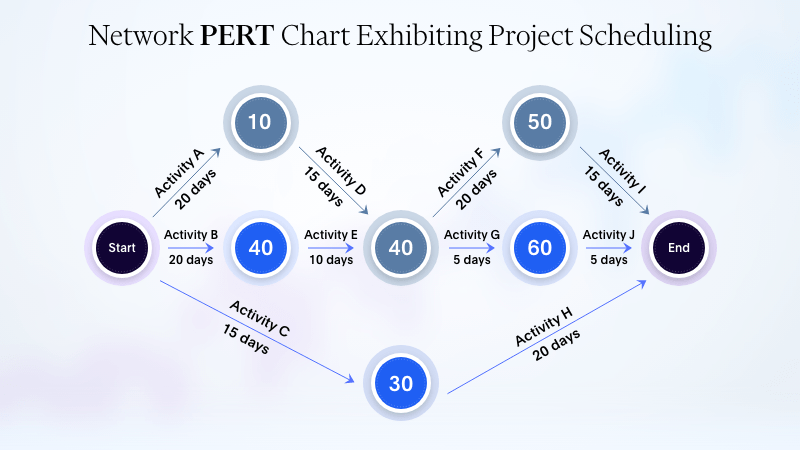
The diagram above is a simple example that illustrates the three main parts of the PERT chart. Let’s take a closer look.
- The arrows show the relation between tasks. This represents the flow of the project from the beginning to the end.
- The duration or estimated completion time for each task is mentioned inside the squares below the task name.
- Last but not least, let’s talk about task dependencies. Other than the flow of the project, the arrows also show the relation between tasks and their priorities in the project.
As shown, tasks 1, 2, and 3 are independent of one another. However, all other tasks that follow these are reliant on one or the other. For instance, Task 7 can only start after both tasks 4 and 5 are completed.
Unlike Gantt charts that are represented as horizontal bar charts across a timeline, a PERT chart is depicted via a visual flowchart.
PERT and Gantt charts are often used in conjunction for visualization of project timelines and may seem to have similar attributes, but their layout and purpose of use are different.
Why Use a PERT Chart?
A PERT chart can be useful for tracking project progress and highlighting areas that may require additional effort. Additionally, it can ensure accountability by allowing each team member to view how their work stacks up against the work of other teams in specific categories.
Usually, you can use this chart during the planning stage of a project to map out the project’s scope and get an understanding of the expected completion process, as part of the feasibility study.
Project managers use PERT charts when scenarios, as mentioned below, need to be taken care of.
To Plan Complex Projects
Managers can use the chart to quickly and easily plan complex projects. These charts display the real-time progress of any project by showing what’s happening in each activity and how it fits into the task’s priorities. It’s a great way to show how different activities relate to each other.
To Boost Communication Across Teams
The PERT analysis process involves the collection of data from all departments. This sets each department’s accountability and assists in the identification of personnel tasked with key responsibilities for the project. This, in turn, fosters communication during the project and contributes to its success.
To Get a What-if Analysis
When analyzing what-if scenarios, PERT charts can help companies figure out all the potential workflows. It can also assist in picking a workflow that makes the most sense, in turn helping companies get the most bang for their buck. The chart analyzes data from different departments in an organization.
To Determine the Critical Path
Using the Critical Path Method (CPM) can be a great way to plan and manage complicated projects and figure out how much time each task will take.
CPM defines the order of actions that determine how long the project will take to be complete. It becomes instrumental when you’re dealing with projects that have:
- overlapping areas
- a longer completion time
- delays
With a PERT chart, you can:
- approach the project scheduling on a task-by-task basis
- show each task in a flow chart
- get a pretty accurate estimate of how long each task is going to take
Many project managers use these charts to easily view each task and its placement on the project timeline while also determining the timespan of each activity.
To Evaluate Resources
Managers use PERT charts to figure out how much time and money they have to spend on projects. It shows tasks that need to be done and how many resources will be required. It’s used to figure out how long projects will take when there are a lot of unknown factors.
This information about resource management is clear and available to everyone, including managers and stakeholders.
To Evaluate Time
A PERT Chart, also called a PERT diagram, provides project managers with a precise estimate of the time required for each task and the project’s total duration. This feature is extremely useful as it outlines the anticipated timeline and is beneficial for managers during the initial planning stage of a project.
In summary, a PERT diagram is helpful as a straightforward tool to create and structure diagrams for straightforward projects. It’s a convenient way to indicate the resources and timelines associated with a project.
How to Make a PERT Chart
Even if you choose to draw the chart and do all the calculations yourself, you don’t need to worry about it. Here’s an easy 5-step process you can follow to make your PERT chart:
Step 1: Identify Project Tasks
The first step to making a great PERT chart is finding and gathering all the info and tasks you need for the project. You can start the project planning phase the same way you’d start the project management phase with the following:
- A business case
- A communication plan
- An initial kick-off meeting
Planning ahead means you’re ready to set up dependencies and link tasks during each of the stages mentioned above.
Step 2: Define Task Dependencies
A task dependency (sometimes called a logical relationship) is the order in which tasks within a project have to be performed. You can’t start or finish these tasks unless a task before them has been initiated or completed.
For example, a work breakdown structure (WBS) often includes a work dependency.
By creating dependencies, you can keep track of work, make sure tasks are done, and have clear communication. For complex projects, it’s important to plan the timeline and duration of the project well in advance.
A PERT diagram visualizes dependencies by connecting and organizing tasks. It’s not as detailed as other methods, such as a work breakdown, but it helps to visualize the high-level view of tasks and work required to complete them.
Step 3: Connect Project Tasks
Once you’ve established task dependencies, the next step is creating a PERT chart by linking the project tasks.
This chart is composed of arrows representing tasks and nodes representing events or milestones.
For instance, the parent event can be placed within the nodes (represented by numbered circles or squares), and the task arrows represent the dependencies necessary to complete the event.
This layout provides a straightforward project structure that’s not overly specific but easy for stakeholders to understand.
Step 4: Estimate Project Time Frame
Next, it’s necessary to calculate the project’s total duration using the CPM (Critical Path Method) and PERT formula.
CPM is the process of determining the length of the sequence of tasks necessary to complete the entire project.
The goal is to identify the path that will require the most time to be completed. This will help determine the shortest total project duration.
The time estimates can be determined by using the PERT formula, which calculates the expected duration of the task and the completion time by multiplying it by 6.
E = O + 4 x M + P/6
Where:
Optimistic time = O
Pessimistic time = P
Most Likely Time = M
Expected Time = E
Once you’ve calculated the expected time, you can add up all the estimates from your critical path to get the average project timeline.
Step 5: Manage Task Progress
Once you’ve set up your PERT chart, the next step is to keep track of how it’s going.
You’ll need to close any dependencies and ensure everything runs smoothly until all the tasks and milestones are finished.
Remember that your PERT diagram needs to be kept up to date with any changes that come up.
Moreover, you could use a change control system to keep track of and communicate any changes to the project. Once all the tasks are done, you can store them in a shared area so you can refer to them later.
Examples of PERT Charts
Project managers use PERT as a data visualization tool to easily envision the tasks at hand within a project. By doing so, project managers can coordinate these tasks across the teams and departments involved in the project.
Below are three examples of how this chart can be used to compute a practical timetable before a project begins.
1. Network PERT Chart
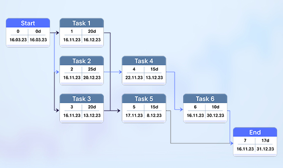
This type of chart has multiple task nodes with each node having more details about the task, such as estimated time, duration, start time, and completion time.
A good example of a network PERT chart can be seen below:

2. Simple PERT Chart
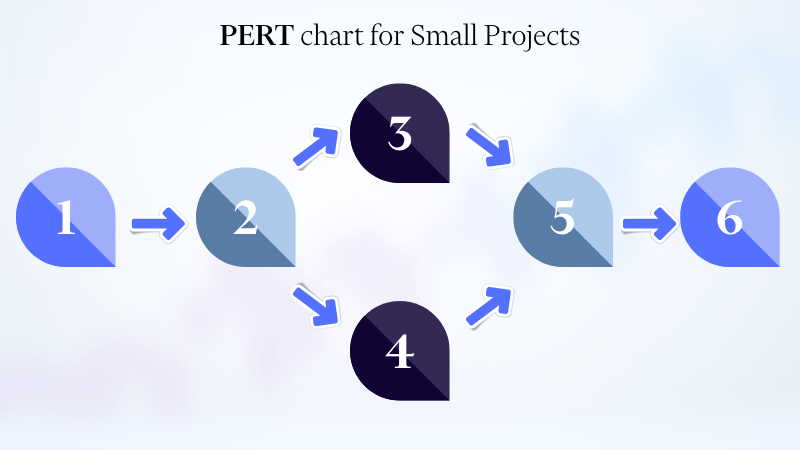
If you need a PERT chart that’s super easy to use, this is the template for you! It has an activity-on-arrow design, with arrows showing what needs to be done and how the tasks flow.

The chart above is a basic example of a simple PERT chart. This type of chart is mostly useful for smaller projects. As illustrated above, all the tasks are in a flow without too many dependencies branching in between.
3. Vertical PERT Chart
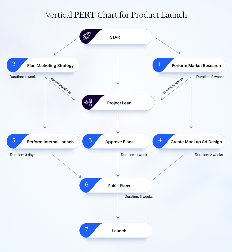
This one has a vertical layout, hence the name. Such charts are no different from the two other layouts mentioned above. The chart reflects the same elements as time, dependencies, CPM, and resources, just as the other layouts.

Improve Your Projects With PERT Charts
It’s no secret that project management can be a challenge. Taking a project from beginning to end takes a lot of hard work, discipline, and focus.
The use of PERT Charts facilitates the management of time-critical projects with interdependent tasks. This enables the team to have a clear approach and be prepared for any eventuality that may arise.
However, these charts are unsuitable for long-lasting projects, as these will demand numerous modifications, which may require additional personnel. It’ll be challenging to monitor the project’s progress this way.
By creating your own PERT diagram, you can be confident about executing your next project in a planned manner. A straightforward structure with timeline projections will ensure that your team clearly understands the project’s objectives and gets ready to tackle any challenges that may arise.
Such charts are a great way for project managers to stay on top of their projects and ensure everything runs smoothly. These can help improve communication between stakeholders, identify potential risks and bottlenecks, better coordinate tasks, and give you a clearer view of what’s going on.
If you’re looking for a tool to help you manage your short-term projects this way, then PERT charts are the way to go.
Frequently Asked Questions (FAQs)
1. How to make a PERT chart in Excel
- In a new Excel spreadsheet, click the “Insert” tab on the menu bar.
- Select a flowchart shape from the Shapes section.
- Now, type the task name into the shape.
- Repeat steps 2 & 3 for each task.
- Connect the tasks by using the “Line” button in the “Shapes” menu. Drag this line from one Shape to another. Repeat this for each connection.
- Insert a Text Box from the Insert tab, drag it to the desired position and enter text.
- To format your chart, go to the “Home” tab and click on the “Format” button.
2. What’s the advantage of using a PERT chart?
PERT charts help track what’s being done during a project and are also helpful in knowing:
- the time and money each task requires
- how long everyone takes to get their work done
- the time it’ll take to finish the project

